Activities
- App
- UI UX
Company
Scoot
About.
Scoot Tigerair Pte Ltd, operating as Scoot, is a Singaporean low-cost airline and a subsidiary of Singapore Airlines. It began its operations on 4 June 2012 on medium and long-haul routes from Singapore, predominantly to various airports throughout the Asia-Pacific. Scoot’s airline slogan is Escape the Ordinary.
The Problem
In 2019 the Scoot app faces several issues, primarily stemming from a sub-optimal user experience. Users encounter the inconvenience of having to log in every time they use the app. Additionally, the biometric authentication feature is unreliable. There have also been instances where the addition of 25kg of luggage is not properly displayed. These are just a few examples of the challenges users encounter when using the app.
The Objective
To conduct research, develop strategies, and design a comprehensive Progressive Web App (PWA) with the objective of enhancing the user experience within the digital realm, particularly focusing on improvements for the Scoot app.
Analysis
The lack of a clear understanding of customer wants, needs, and expectations has resulted in user frustrations and confusion regarding pain points. Within the R&D department, the disconnect between user desires and the solutions being developed has become evident. It is essential to evaluate the value that a solution brings to both the user and the business in order to address these challenges effectively.
Empathy Map
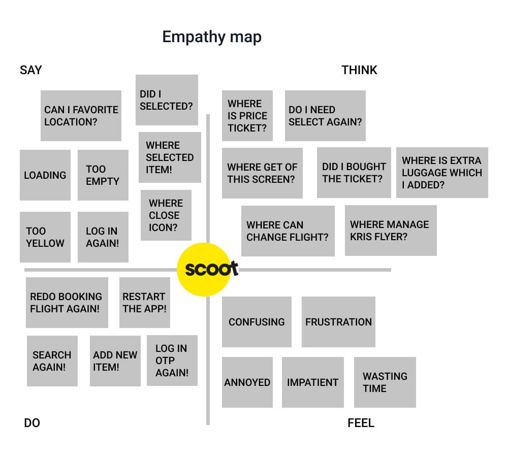
I conducted an investigation and analysis of the Scoot app to gain a clear understanding of the competitive landscape and created an empathy map for further analysis.
Secondary Research
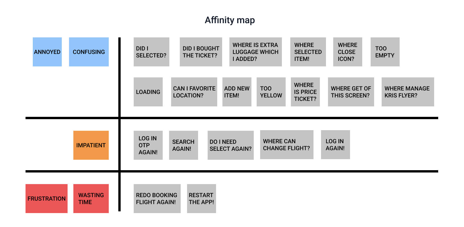
Users require an app that enables them to book flights and other services. They should also have the option to favorite countries or locations, allowing them to receive notifications for the latest promotions from their preferred places. To address these needs, I created affinity maps and prioritized customer pain points, wants, and requirements. Subsequently, I presented these insights to stakeholders. Key issues identified include user frustration due to the app freezing on a particular screen, user impatience arising from frequent login requirements, and user confusion and annoyance caused by missing UI elements.
Customer Journey Map
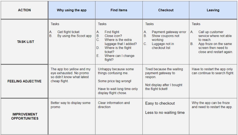
- The home page lacks content and is overly dominated by the color yellow. It would benefit from the addition of more promotional elements to engage users effectively.
- The app experiences freezing issues on a specific screen, which severely impacts the user experience and needs to be addressed promptly.
- Need to have a clean design so that I am able to compare flight tickets.
User Flow
Low Fidelity And Key Mock-ups
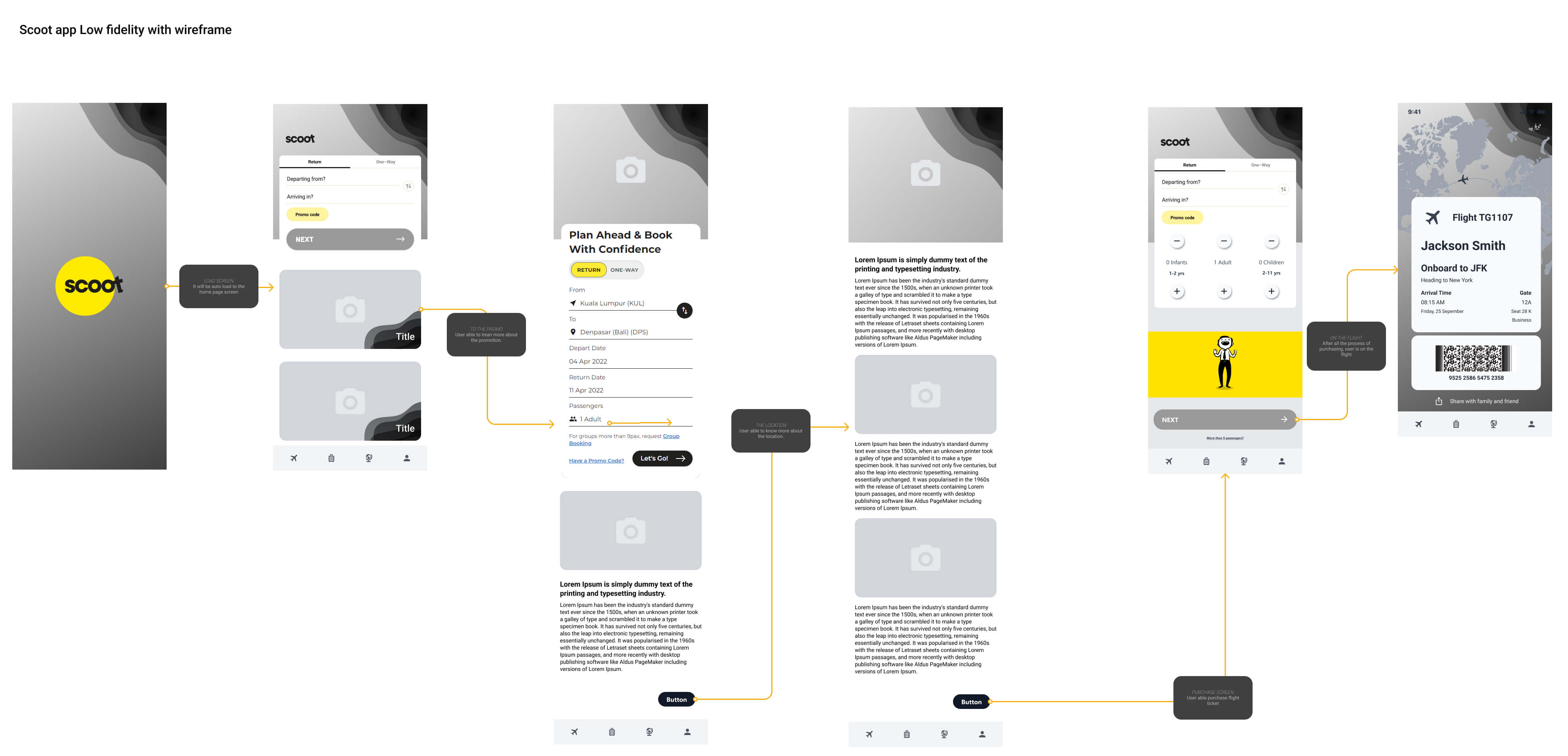
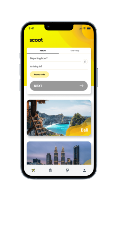
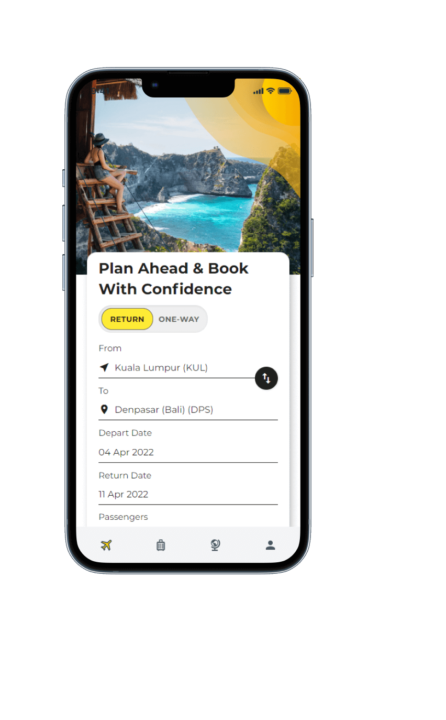
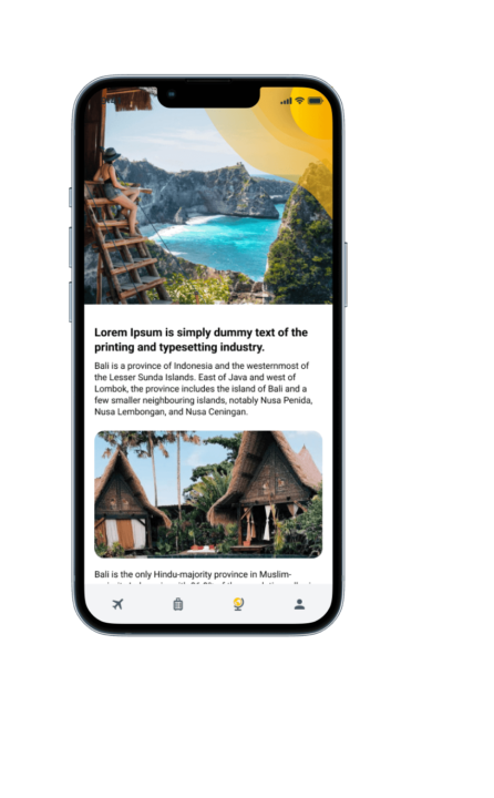
After addressing the critical questions, we promptly initiated the design phase, making user experience improvement a top priority. Our focus was primarily on enhancing the homepage, including a prominent banner for promotions, and streamlining the sign-in process. Our initial emphasis was on ensuring a mobile-first approach.
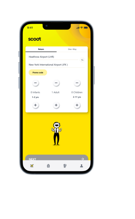
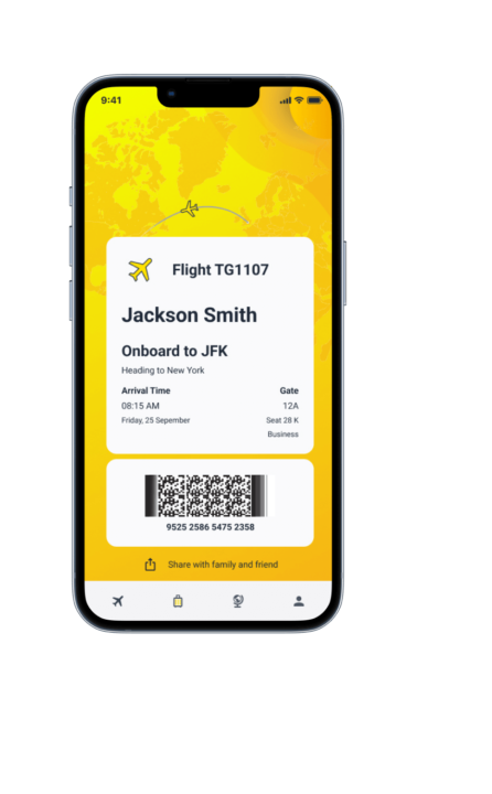
High-fidelity prototype
Next Steps
In the upcoming phase, I plan to conduct another round of usability studies to validate the effectiveness of the enhancements made in addressing the pain points experienced by users. By empathetically observing and gathering feedback from users, we aim to ensure that their needs and concerns have been adequately addressed. This iterative process of testing and refinement enables us to continuously improve the user experience and deliver a product that truly meets their expectations and delights them at every interaction.
Passion leads to success