Activities
- App
- UI UX
Case Study
About.
With the rising prominence of coffee culture and the growing demand for convenient experiences, we identified a pressing need for a comprehensive and user-friendly solution. It is with great pleasure that I present our coffee app, thoughtfully crafted to cater to the discerning needs of both seasoned coffee enthusiasts and casual coffee drinkers.
The Problem
Limited Customization Options
Most of coffee enthusiasts enjoy customizing their beverages with specific blends, flavours, or milk alternatives. However, most coffee shops offer limited options, restricting the ability to create a truly personalized coffee experience.
Ordering and Payment
The coffee experience was made inconvenient due to lengthy queues, unclear menus, and unexpected hidden expenses associated with payment. Customers faced undisclosed costs, complicating the accurate anticipation of the total amount due.
The Objective
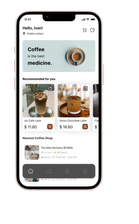
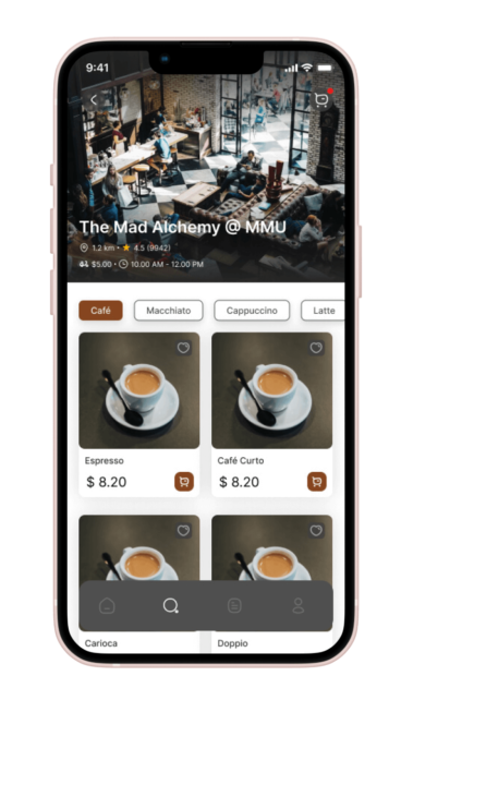
This application makes it easier for people to find the coffee they want by providing guidance to their coffee places. Through a display users can conveniently discover coffee shops and specialty roasters near them. They can browse through menus that clearly display prices upfront allowing them to make informed choices and effectively manage their expenses. Moreover the application provides suggestions based on individual user preferences, allowing them to discover new flavors, brewing methods, and unique coffee experiences tailored to their taste.
Understanding The User
We conducted extensive interviews and used empathy maps to deeply understand our target audience: passionate coffee enthusiasts. Initially, we focused on time-constrained working adults who struggle with brewing their coffee. However, our research revealed various factors affecting users’ ability to access quality coffee, such as obligations, interests, and obstacles. These insights will guide our design process to meet their diverse needs effectively.
User Research Pain Points
Time constraints
Working adults faced challenges in finding the time to engage in the process of brewing their own coffee. This time limitation hindered their ability to enjoy a freshly brewed cup of coffee at home.
Obligations and interests
Users encountered various obligations and interests that made it difficult for them to access a meticulously brewed cup of coffee in person. These factors could include work responsibilities, personal commitments, or other activities that competed for their time and attention.
Access to quality coffee
Users expressed a desire for a high-quality, freshly brewed coffee experience but encountered obstacles in finding or accessing such coffee. This could involve limited availability of specialty coffee shops or difficulties in sourcing premium coffee beans for home brewing.
User Persona

Crystal
Accountant
"Coffee fuels my productivity during long hours as an accountant."
Goals
- Some time in morning you had an fine perfect coffee that is a good start.
- Very good place to work at here, meeting with client et cetera…
- They had perfect chocolate biscuit that hard to find.
Frustration
- Some time at weekend hard to get order without the app and crowded.
- Some time fresh brew coffee end up taste feel more drinking water.
While Crystal appreciates quality coffee, she also wants to manage her coffee expenses effectively. She desires a coffee app that offers pricing transparency, including details on menu prices and any additional charges.
User Journey Map
Crystal goal is easy and quick way to order coffee drink

Paper Sketching
When designing the app on paper, I ensured that the elements selected for inclusion in the digital wireframes were carefully chosen to effectively address user pain points. A primary focus was placed on creating a seamless and efficient ordering process, prioritizing time-saving measures for users. Additionally, the app incorporates an auto-location feature that detects the user’s position and dynamically displays the nearest coffee shop accordingly.


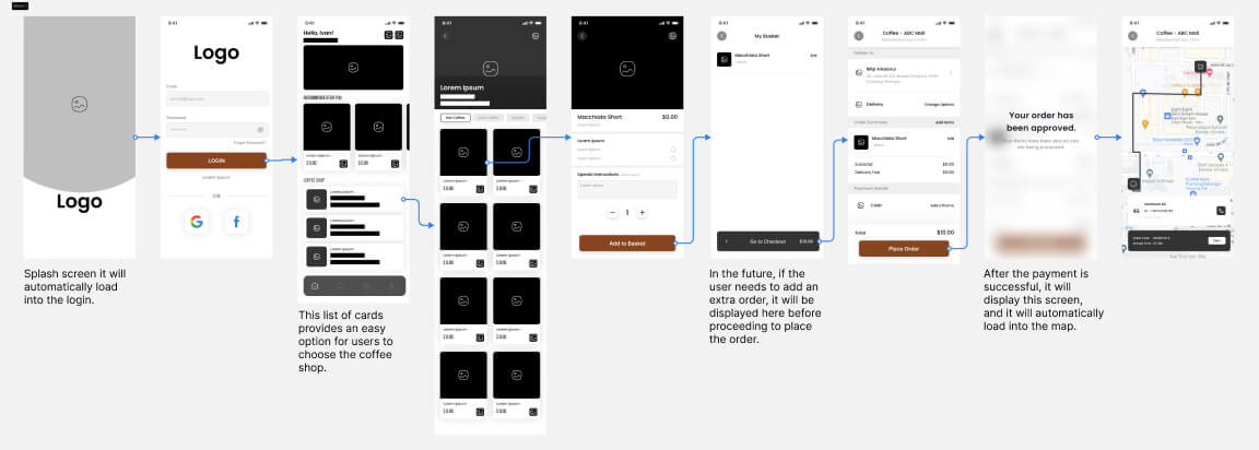
Digital Wire-flow
After meticulously sketching paper wireframes and carefully considering the initial user flow, including the happy path. I reviewed what was necessary, unnecessary, and what areas need to improvement. I dedicated substantial time to this critical phase, ensuring that the underlying user experience (UX), including the smooth and optimal user journey, was refined to perfection before proceeding to the visual design stage.
Low-fidelity Prototype
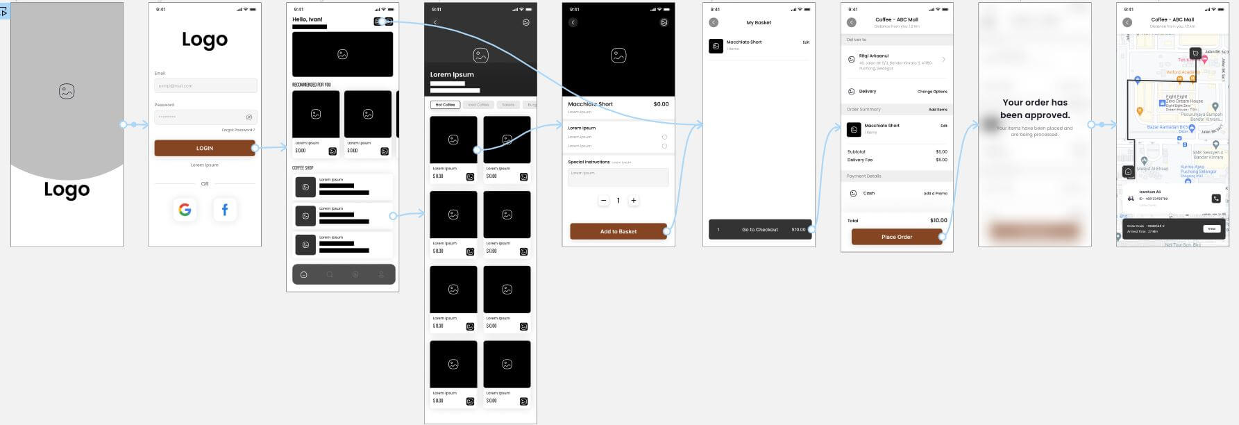
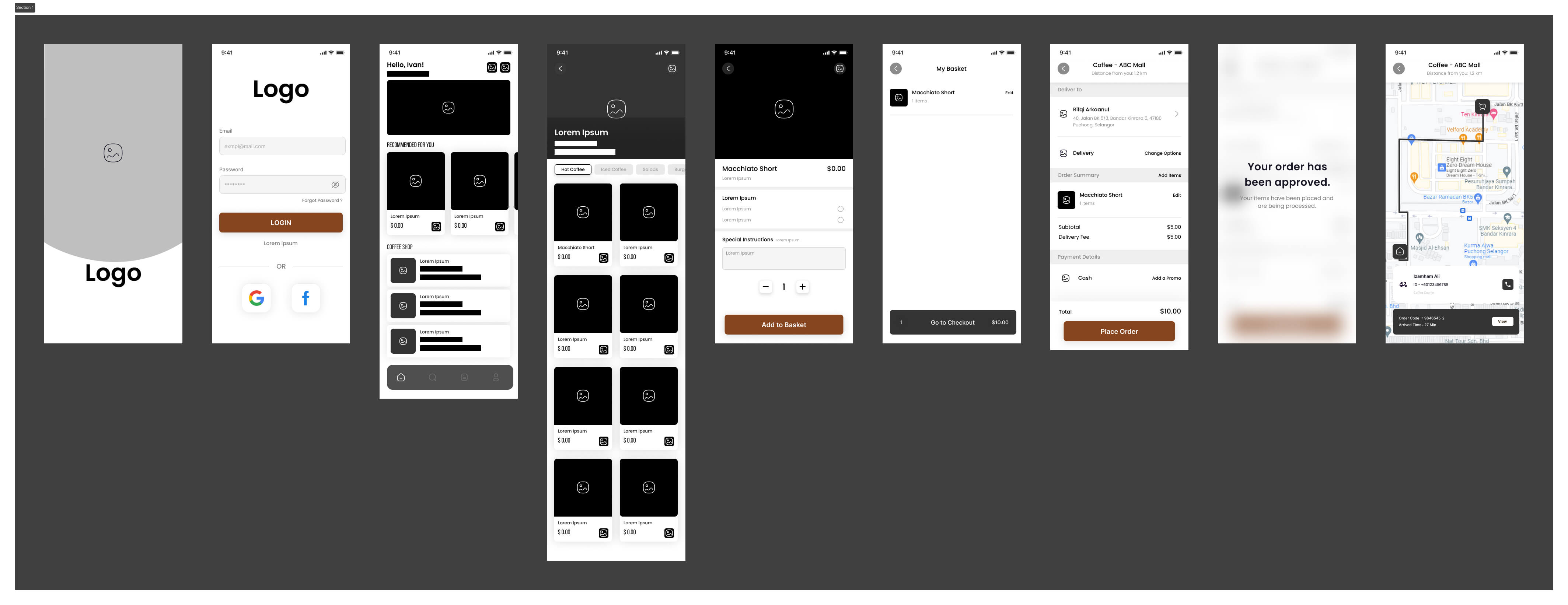
Using the digital wireframes, I created a low-fidelity prototype that emphasized the primary user flow of building and ordering a Macchiato. This prototype was employed in a usability study, including the evaluation of the happy path for an optimal user experience.
Usability Study
I conducted iterative usability studies to enhance the user experience. Initial study findings from the first study helped guide the designs from wireframes to mock-ups. The second study used a high-fidelity prototype and revealed what aspects of the mock-ups needed refining. This meticulous process ensured the final design met user expectations, delivering an exceptional experience.
Round 1 findings
- Users wanted to have more information on the rider and able to view receipt.
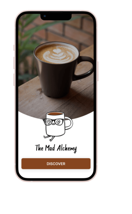
- Users feel better add next on the logo screen, waiting the logo gone.
- Users try to click on one of the radio button and don’t know where to click
Round 2 findings
- Users too overwhelmed by the unable to choose.
- Users who is senior citizen who will take some time discover.
Mock-ups
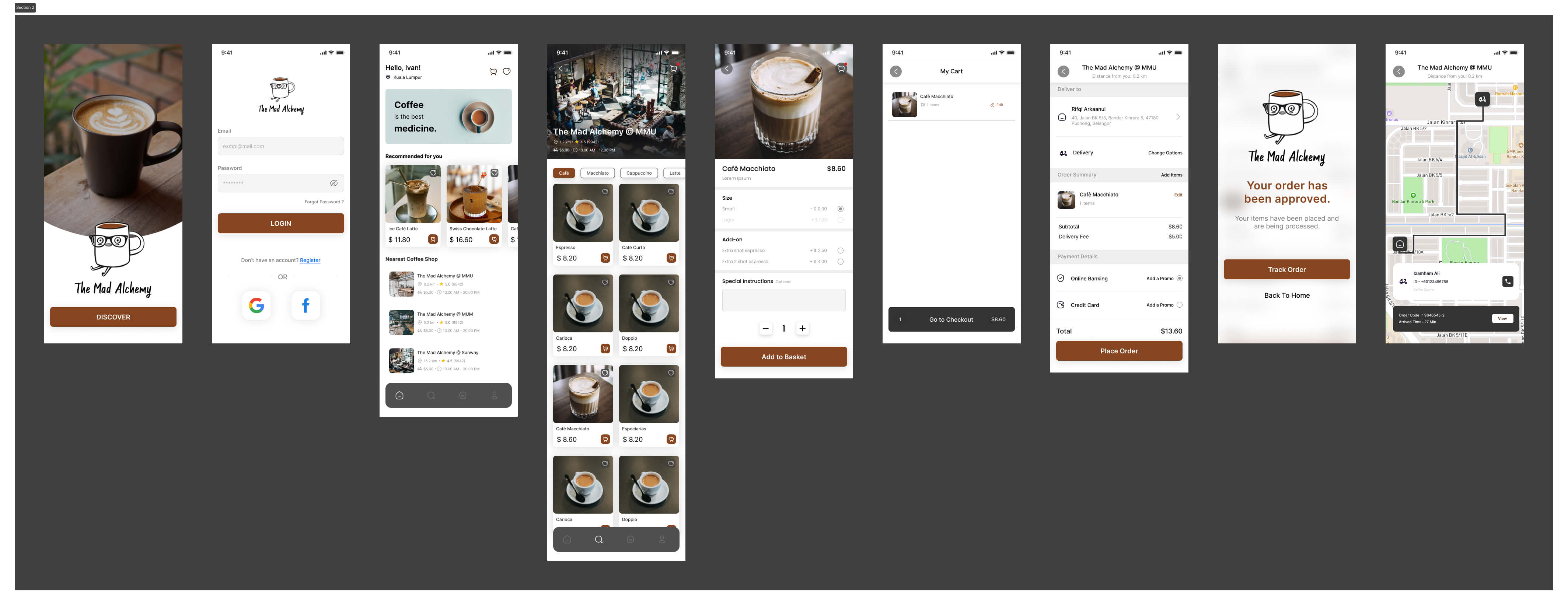
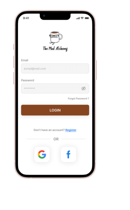
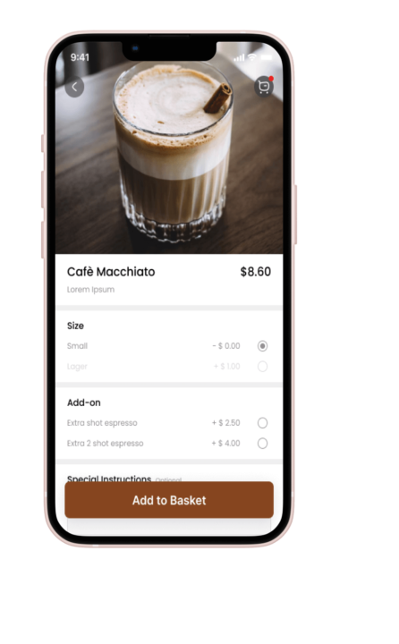
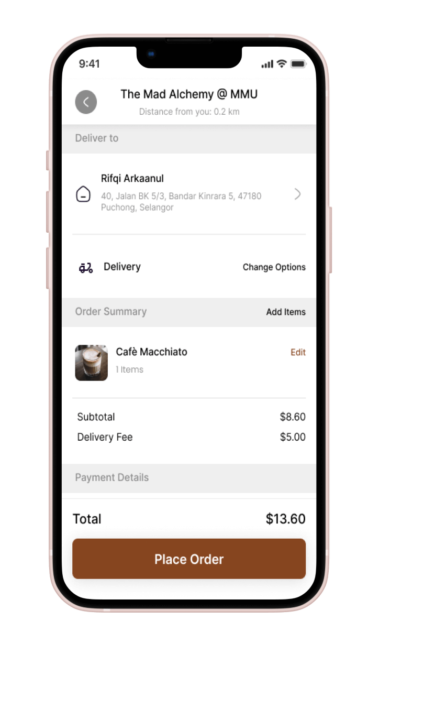
Initially, the early designs incorporated some customization options. However, following the usability studies, I made significant improvements by introducing additional choices within the ‘Item Details’ page for add-on selection. I also incorporated a new call-to-action (CTA) button on the ‘Order Accepted’ page. Furthermore, I carefully revised the design to ensure a user-friendly experience throughout all the page.
Others Key Mock-ups
High-fidelity prototype
Initially, the early designs incorporated some customization options. However, following the usability studies, I made significant improvements by introducing additional choices within the ‘Item Details’ page for add-on selection. I also incorporated a new call-to-action (CTA) button on the ‘Order Accepted’ page. Furthermore, I carefully revised the design to ensure a user-friendly experience throughout all the page.
Accessibility Considerations
- Ensured a user-friendly experience and improved accessibility for individuals with colour blindness by implementing alt text descriptions for images, thus enabling compatibility with screen readers. This inclusive design approach aimed to provide an enjoyable and accessible experience for all users.
- To enhance user understanding of the designs, I utilized detailed imagery for coffee and add-on selections. This approach improved visual clarity and made the options more intuitive for all users.
- Employed intuitive icons to enhance navigation and facilitate ease of use.
Takeaways
Goals
The app expertly caters to the preferences of coffee lovers, leaving them with the impression that “The Mad Alchemy” coffee app possesses a deep understanding of their needs.
One quote from peer feedback
“The app offers a delightful and efficient experience in customizing coffee creations, making it a go-to choice for coffee enthusiasts looking to start their day right.”
What I learned
As I delved into the creation of the “The Mad Alchemy” coffee app, I discovered that the initial ideas were just the starting point on this exciting journey. Each step of the way, I eagerly engaged in usability studies and sought feedback from the diverse range of personas. It was their invaluable insights and experiences that shaped every iteration of the app’s designs. This collaborative and iterative approach allowed us to continuously improve and evolve the app, ensuring it met and exceeded the expectations of our cherished users, delivering a truly delightful and personalized coffee experience.
Next Steps
In the upcoming phase, I plan to conduct another round of usability studies to validate the effectiveness of the enhancements made in addressing the pain points experienced by users. By empathetically observing and gathering feedback from users, we aim to ensure that their needs and concerns have been adequately addressed. This iterative process of testing and refinement enables us to continuously improve the user experience and deliver a product that truly meets their expectations and delights them at every interaction.
Passion leads to success